style> * { margin: 0; padding: 0; box-sizing: border-box; } html { scroll-behavior: smooth; } body { font-family: -apple-system, BlinkMacSystemFont, 'Segoe UI', Roboto, Oxygen, Ubuntu, Cantarell, sans-serif; background: #0a0a0a; color: #ffffff; line-height: 1.6; overflow-x: hidden; } .header { position: fixed; top: 0; left: 0; right: 0; z-index: 1000; padding: 1rem 0; background: rgba(10, 10, 10, 0.98); backdrop-filter: blur(10px); border-bottom: 1px solid rgba(255, 255, 255, 0.05); transition: all 0.3s ease; } .header.scrolled { padding: 0.75rem 0; box-shadow: 0 4px 30px rgba(0, 0, 0, 0.3); } .container { max-width: 1200px; margin: 0 auto; padding: 0 1rem; } .header-content { display: flex; justify-content: space-between; align-items: center; } .logo { display: flex; align-items: center; gap: 0.75rem; text-decoration: none; } .logo-img { width: 50px; height: 50px; border-radius: 100px; object-fit: cover; filter: grayscale(100%); } .logo-text { font-size: 1.25rem; font-weight: 700; color: #ffffff; text-transform: uppercase; letter-spacing: 1px; } .desktop-nav { display: flex; gap: 2rem; align-items: center; } .nav-link { color: rgba(255, 255, 255, 0.7); text-decoration: none; font-weight: 500; padding: 0.5rem 0; position: relative; transition: color 0.3s ease; font-size: 0.95rem; text-transform: uppercase; letter-spacing: 0.5px; } .nav-link:hover { color: #ffffff; } .nav-link::after { content: ''; position: absolute; bottom: 0; left: 0; width: 0; height: 1px; background: #ffffff; transition: width 0.3s ease; } .nav-link:hover::after { width: 100%; } .mobile-menu-btn { display: none; background: none; border: none; color: #ffffff; font-size: 1.5rem; cursor: pointer; padding: 0.5rem; transition: transform 0.3s ease; } .mobile-menu-btn:hover { transform: scale(1.1); } .hero { min-height: 100vh; display: flex; align-items: center; position: relative; overflow: hidden; padding-top: 80px; } .hero::before { content: ''; position: absolute; top: 0; left: 0; right: 0; bottom: 0; background: radial-gradient(circle at 30% 50%, rgba(255,255,255,0.03) 0%, transparent 60%); pointer-events: none; } .hero-content { max-width: 800px; margin: 0 auto; text-align: center; position: relative; z-index: 2; } .hero-title { font-size: clamp(2rem, 5vw, 3.5rem); font-weight: 800; line-height: 1.2; margin-bottom: 1.5rem; opacity: 0; transform: translateY(30px); animation: fadeUp 1s ease forwards; color: #ffffff; } .gradient-text { color: #ffffff; font-weight: 300; opacity: 0.8; } .hero-subtitle { font-size: clamp(1rem, 2vw, 1.25rem); color: rgba(255, 255, 255, 0.6); margin-bottom: 2.5rem; opacity: 0; transform: translateY(30px); animation: fadeUp 1s ease 0.2s forwards; max-width: 650px; margin-left: auto; margin-right: auto; } .hero-buttons { display: flex; gap: 1rem; justify-content: center; flex-wrap: wrap; opacity: 0; transform: translateY(30px); animation: fadeUp 1s ease 0.4s forwards; } .btn { padding: 1rem 2rem; border-radius: 0; font-weight: 600; font-size: 0.9rem; text-decoration: none; transition: all 0.3s ease; display: inline-block; border: none; cursor: pointer; text-transform: uppercase; letter-spacing: 1px; } .btn-primary { background: #ffffff; color: #0a0a0a; box-shadow: 0 4px 20px rgba(255, 255, 255, 0.1); } .btn-primary:hover { background: #cccccc; transform: translateY(-3px); box-shadow: 0 8px 25px rgba(255, 255, 255, 0.15); } .btn-secondary { background: transparent; border: 1px solid rgba(255, 255, 255, 0.3); color: #ffffff; } .btn-secondary:hover { border-color: #ffffff; background: rgba(255, 255, 255, 0.05); transform: translateY(-3px); } .btn-outline { background: transparent; border: 1px solid rgba(255, 255, 255, 0.3); color: #ffffff; } .btn-outline:hover { border-color: #ffffff; background: rgba(255, 255, 255, 0.05); } @keyframes fadeUp { to { opacity: 1; transform: translateY(0); } } .section { padding: 5rem 0; position: relative; border-bottom: 1px solid rgba(255, 255, 255, 0.02); } .section-header { text-align: center; margin-bottom: 4rem; } .section-title { font-size: clamp(1.75rem, 4vw, 2.5rem); font-weight: 600; margin-bottom: 1rem; color: #ffffff; text-transform: uppercase; letter-spacing: 2px; } .section-title span { color: rgba(255, 255, 255, 0.4); font-weight: 300; } .section-subtitle { font-size: clamp(0.9rem, 2vw, 1.1rem); color: rgba(255, 255, 255, 0.5); max-width: 600px; margin: 0 auto; text-transform: uppercase; letter-spacing: 2px; } .services-grid { display: grid; grid-template-columns: repeat(auto-fit, minmax(250px, 1fr)); gap: 2rem; margin-top: 3rem; } .service-card { text-align: center; padding: 2.5rem 2rem; background: rgba(255, 255, 255, 0.02); border: 1px solid rgba(255, 255, 255, 0.05); transition: all 0.4s ease; } .service-card:hover { background: rgba(255, 255, 255, 0.03); border-color: rgba(255, 255, 255, 0.2); transform: translateY(-5px); } .service-icon { width: 70px; height: 70px; margin: 0 auto 1.5rem; background: rgba(255, 255, 255, 0.05); border-radius: 50%; display: flex; align-items: center; justify-content: center; font-size: 1.8rem; color: #ffffff; border: 1px solid rgba(255, 255, 255, 0.1); } .service-card h3 { font-size: 1.25rem; margin-bottom: 1rem; font-weight: 600; color: #ffffff; letter-spacing: 1px; } .service-card p { color: rgba(255, 255, 255, 0.5); margin-bottom: 1.5rem; font-size: 0.95rem; } .vision-grid { display: grid; grid-template-columns: repeat(auto-fit, minmax(300px, 1fr)); gap: 2rem; } .vision-card { background: rgba(255, 255, 255, 0.02); padding: 3rem 2rem; border: 1px solid rgba(255, 255, 255, 0.05); transition: all 0.4s ease; text-align: center; } .vision-card:hover { background: rgba(255, 255, 255, 0.03); border-color: rgba(255, 255, 255, 0.15); transform: translateY(-5px); } .vision-icon { width: 70px; height: 70px; margin: 0 auto 2rem; background: rgba(255, 255, 255, 0.05); border-radius: 50%; display: flex; align-items: center; justify-content: center; font-size: 1.8rem; color: #ffffff; border: 1px solid rgba(255, 255, 255, 0.1); } .vision-card h3 { font-size: 1.3rem; margin-bottom: 1rem; color: #ffffff; letter-spacing: 1px; } .vision-card p { color: rgba(255, 255, 255, 0.5); } .about-container { display: grid; grid-template-columns: 1fr 1fr; gap: 4rem; align-items: center; } .about-image { position: relative; } .about-image img { width: 100%; border-radius: 0; filter: grayscale(100%); border: 1px solid rgba(255, 255, 255, 0.1); } .about-features { margin-top: 2rem; } .feature-item { display: flex; align-items: center; gap: 1rem; margin-bottom: 1rem; color: rgba(255, 255, 255, 0.7); } .feature-dot { width: 6px; height: 6px; background: #ffffff; opacity: 0.5; } .partnerships-grid { display: grid; grid-template-columns: repeat(auto-fit, minmax(200px, 1fr)); gap: 2rem; margin-top: 3rem; } .partnership-logo { background: rgba(255, 255, 255, 0.02); padding: 2rem; border: 1px solid rgba(255, 255, 255, 0.05); transition: all 0.3s ease; text-align: center; } .partnership-logo:hover { border-color: rgba(255, 255, 255, 0.2); background: rgba(255, 255, 255, 0.03); } .partnership-logo img { max-width: 100%; height: 50px; object-fit: contain; filter: grayscale(100%) brightness(1.5); opacity: 0.7; transition: 0.3s ease; } .partnership-logo:hover img { opacity: 1; filter: grayscale(0%) brightness(1); } .contact-grid { display: grid; grid-template-columns: 1fr 1fr; gap: 4rem; margin-top: 3rem; } .contact-info h3 { font-size: 1.75rem; margin-bottom: 2rem; color: #ffffff; font-weight: 500; letter-spacing: 1px; } .contact-items { margin-bottom: 3rem; } .contact-item { display: flex; gap: 1rem; margin-bottom: 2rem; align-items: flex-start; } .contact-icon { width: 48px; height: 48px; background: rgba(255, 255, 255, 0.03); border: 1px solid rgba(255, 255, 255, 0.1); display: flex; align-items: center; justify-content: center; font-size: 1.2rem; color: #ffffff; flex-shrink: 0; } .contact-item h4 { font-size: 0.9rem; margin-bottom: 0.3rem; color: rgba(255, 255, 255, 0.8); letter-spacing: 1px; } .contact-item p { color: rgba(255, 255, 255, 0.5); font-size: 0.95rem; } .footer-social { display: flex; gap: 1rem; margin-top: 1.5rem; } .social-icon { width: 44px; height: 44px; background: rgba(255, 255, 255, 0.02); border: 1px solid rgba(255, 255, 255, 0.05); display: flex; align-items: center; justify-content: center; color: #ffffff; text-decoration: none; transition: all 0.3s ease; font-size: 1.2rem; } .social-icon:hover { background: #ffffff; color: #0a0a0a; border-color: #ffffff; transform: translateY(-3px); } .contact-action { background: rgba(255, 255, 255, 0.02); padding: 3.5rem; text-align: center; border: 1px solid rgba(255, 255, 255, 0.05); display: flex; flex-direction: column; gap: 2rem; } .contact-action h3 { font-size: 1.5rem; margin-bottom: 1rem; color: #ffffff; font-weight: 500; } .contact-action p { color: rgba(255, 255, 255, 0.5); margin-bottom: 1rem; } .application-box { margin: 1.5rem 0; padding: 2rem 0; border-top: 1px solid rgba(255, 255, 255, 0.1); border-bottom: 1px solid rgba(255, 255, 255, 0.1); } .application-box p { color: rgba(255, 255, 255, 0.7); margin-bottom: 1.5rem; font-style: italic; } .application-box .btn { min-width: 250px; } .footer { background: #050505; padding: 4rem 0 2rem; border-top: 1px solid rgba(255, 255, 255, 0.02); } .footer-grid { display: grid; grid-template-columns: repeat(auto-fit, minmax(250px, 1fr)); gap: 3rem; margin-bottom: 3rem; } .footer-column h3 { font-size: 1.25rem; margin-bottom: 1.5rem; color: #ffffff; font-weight: 500; letter-spacing: 1px; } .footer-logo { display: flex; align-items: center; gap: 1rem; margin-bottom: 1.5rem; } .footer-column p { color: rgba(255, 255, 255, 0.4); line-height: 1.7; margin-bottom: 1.5rem; font-size: 0.9rem; } .footer-column ul { list-style: none; } .footer-column ul li { margin-bottom: 0.75rem; } .footer-column ul li a { color: rgba(255, 255, 255, 0.4); text-decoration: none; transition: color 0.3s ease; font-size: 0.9rem; } .footer-column ul li a:hover { color: #ffffff; } .footer-bottom { text-align: center; padding-top: 2rem; border-top: 1px solid rgba(255, 255, 255, 0.02); color: rgba(255, 255, 255, 0.2); font-size: 0.8rem; letter-spacing: 1px; } .whatsapp-btn { position: fixed; bottom: 2rem; right: 2rem; width: 56px; height: 56px; background: #ffffff; border-radius: 0; display: flex; align-items: center; justify-content: center; color: #0a0a0a; font-size: 1.6rem; text-decoration: none; box-shadow: 0 4px 20px rgba(255, 255, 255, 0.1); z-index: 999; transition: all 0.3s ease; border: 1px solid rgba(255, 255, 255, 0.2); } .whatsapp-btn:hover { background: #cccccc; transform: scale(1.1); } .mobile-menu { position: fixed; top: 0; right: -100%; width: 100%; height: 100%; background: rgba(10, 10, 10, 0.98); z-index: 1500; transition: right 0.4s ease; backdrop-filter: blur(20px); display: flex; flex-direction: column; } .mobile-menu.active { right: 0; } .mobile-menu-header { padding: 2rem; display: flex; justify-content: space-between; align-items: center; border-bottom: 1px solid rgba(255, 255, 255, 0.1); } .close-menu { background: none; border: none; color: #ffffff; font-size: 1.5rem; cursor: pointer; padding: 0.5rem; } .mobile-nav { padding: 2rem; display: flex; flex-direction: column; gap: 1rem; } .mobile-nav-link { color: rgba(255, 255, 255, 0.7); text-decoration: none; font-size: 1.2rem; padding: 1rem 0; border-bottom: 1px solid rgba(255, 255, 255, 0.05); transition: color 0.3s ease; text-transform: uppercase; letter-spacing: 1px; } .mobile-nav-link:hover { color: #ffffff; } @media (max-width: 1024px) { .about-container, .contact-grid { grid-template-columns: 1fr; gap: 3rem; } } @media (max-width: 768px) { .desktop-nav { display: none; } .mobile-menu-btn { display: block; } .hero { padding-top: 70px; } .hero-buttons { flex-direction: column; align-items: center; } .btn { width: 100%; max-width: 280px; text-align: center; } .contact-action { padding: 2.5rem 1.5rem; } .footer-grid { grid-template-columns: 1fr; gap: 2rem; } .application-box .btn { min-width: auto; width: 100%; } } @media (max-width: 480px) { .section { padding: 3rem 0; } .services-grid, .vision-grid { grid-template-columns: 1fr; } .service-card, .vision-card { padding: 2rem 1.5rem; } .partnerships-grid { grid-template-columns: 1fr; } } .lazy-section { opacity: 0; transform: translateY(30px); transition: opacity 0.8s ease, transform 0.8s ease; } .lazy-section.visible { opacity: 1; transform: translateY(0); }
Profesyonel video prodüksiyon, drone çekimleri ve dijital içerik çözümleriyle markanızı ekranda değil, hafızalarda büyütüyoruz.
Vizyonumuz, markaların dijital dünyada kalıcı bir iz bırakmasını sağlamak.
Her projeyi özgün fikirlerle şekillendiriyor, markanızı unutulmaz kılacak içerikler üretiyoruz.
En yüksek kalite standartlarını benimsiyor, her detayı özenle işliyoruz.
Ürettiğimiz içeriklerle markanızın görünürlüğünü artırıyor, hedef kitlenize ulaşıyoruz.
Her projeyi özgün fikirlerle şekillendiriyor, markanızı unutulmaz kılacak içerikler üretiyoruz. Bozer Medya, fikir aşamasından çekime, kurgu ve yayına kadar tüm prodüksiyon sürecini profesyonelce yöneten bir ajanstır.
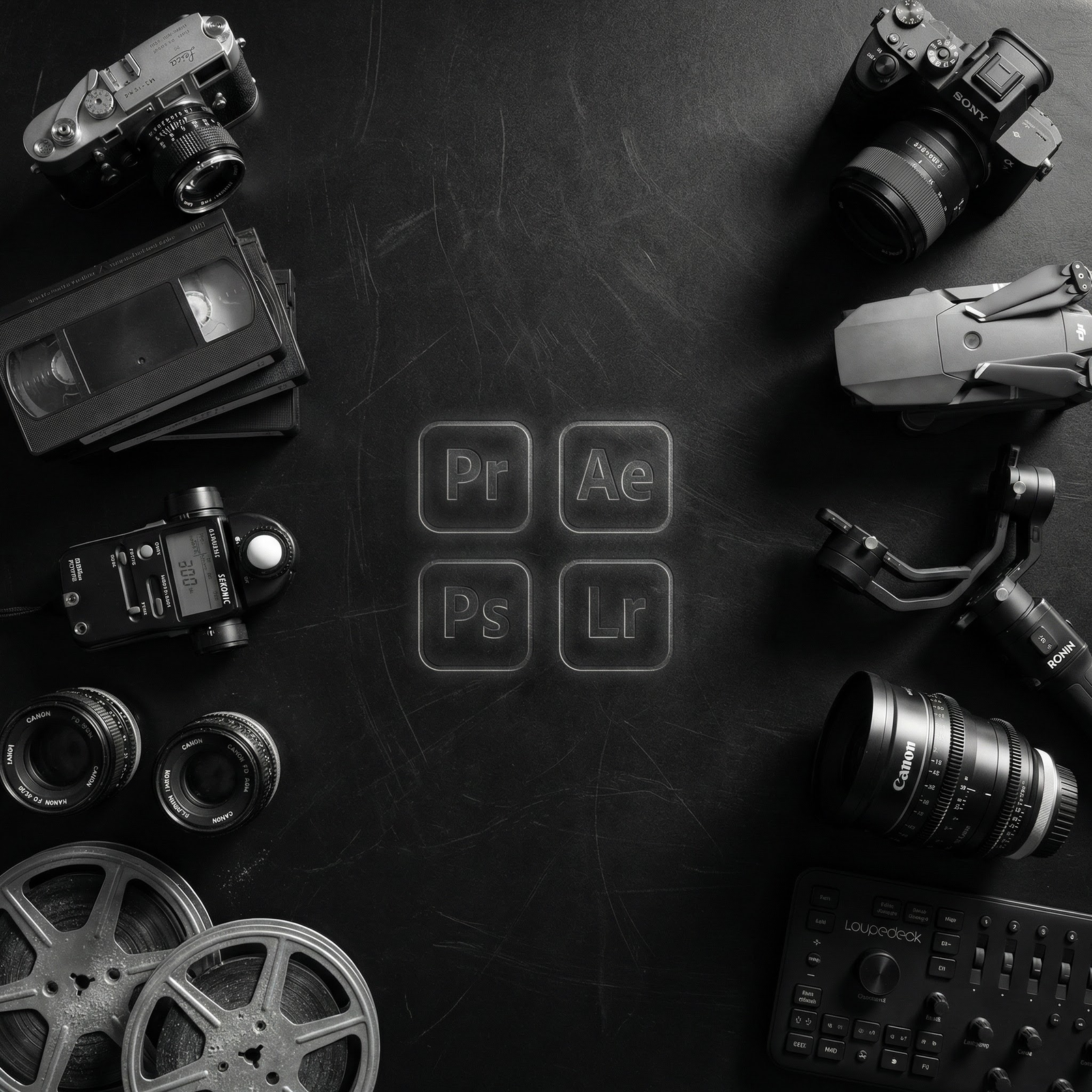
Deneyimli ekibimiz ve son teknoloji ekipmanlarımızla; markaların değerini artıran, izleyicide kalıcı iz bırakan içerikler üretiyoruz.
Her marka için özel, kreatif ve teknolojik çözümler
Sinematik kalitede reklam filmleriyle markanızın hikâyesini ekrana taşıyoruz.
4K çözünürlükte havadan çekimlerle markanız için etkileyici bir perspektif sunuyoruz.
Renk düzenleme, ses miksajı ve motion graphics ile içeriklerinizi sanat eserine dönüştürüyoruz.
Strateji, içerik planlama ve yaratıcı videolarla markanızın sosyal medyada güçlü bir kimlik kazanmasını sağlıyoruz.
Projeniz hakkında konuşmak için bizimle iletişime geçin
İzmir | Balıkesir | Manisa
+90 538 373 52 74
info@bozermedya.com
✨ Markanızı dijitalde güçlü bir konuma taşımak ister misiniz? ✨
Müşteri ön değerlendirme formumuzu doldurarak süreci başlatabilirsiniz.
Değerlendirme Formu